Documentation + User Guide
Concept and Vision:
General:
The final game lines up pretty closely with the concept document. There's really not any serious changes, so this section is just to compare how things turned out rather than just explain every difference.
Big differences:
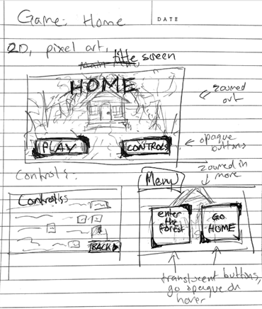
- Added a few menu screens
- Added a pathway between the screens rather than clicking
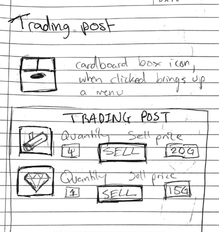
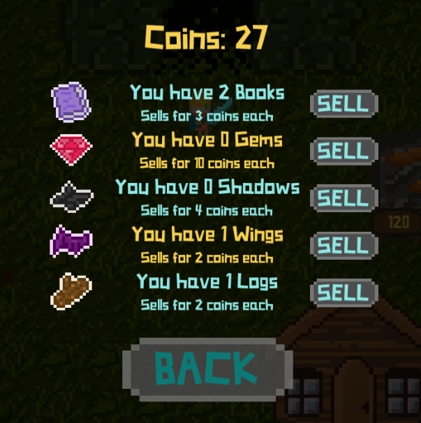
- Changed how the 'sell' screen looked
- There are no chicken npcs (Sorry!)
Even then, the biggest differences are tiny. These are all explained in further detail below.
Visuals:
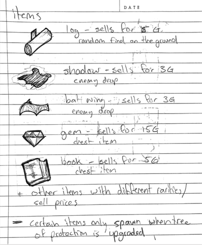
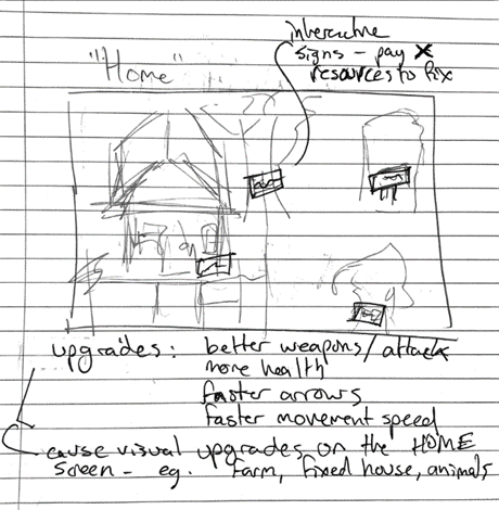
Almost all sprites in the game were based on my original drawings. Almost every aspect of the game looks exactly as it did in the concept document. This is mainly because when drawing the sprites, I traced my original sketches into the art program. I believe that drawing everything and planning beforehand helped keep all of the sprites cohesive and on theme with eachother.
Mechanics:
In the concept document, the main mechanic of the game was the swap between forest combat and peaceful house upgrades. This has not changed at all during the design process. One tiny difference was the inclusion of a tunnel to directly walk between scenes rather than entirely navigate through menus/buttons. This change was made since clicking the buttons felt disconnected from the gameplay. The buttons remain in the game still though, as most games have buttons to exit to menu etc.
Audio:
The music used in the game was the same tracks given as examples in the concept document, simply because they fit the game better than I expected and finding good free tracks that fit together was an oppurtunity I wasn't going to waste.
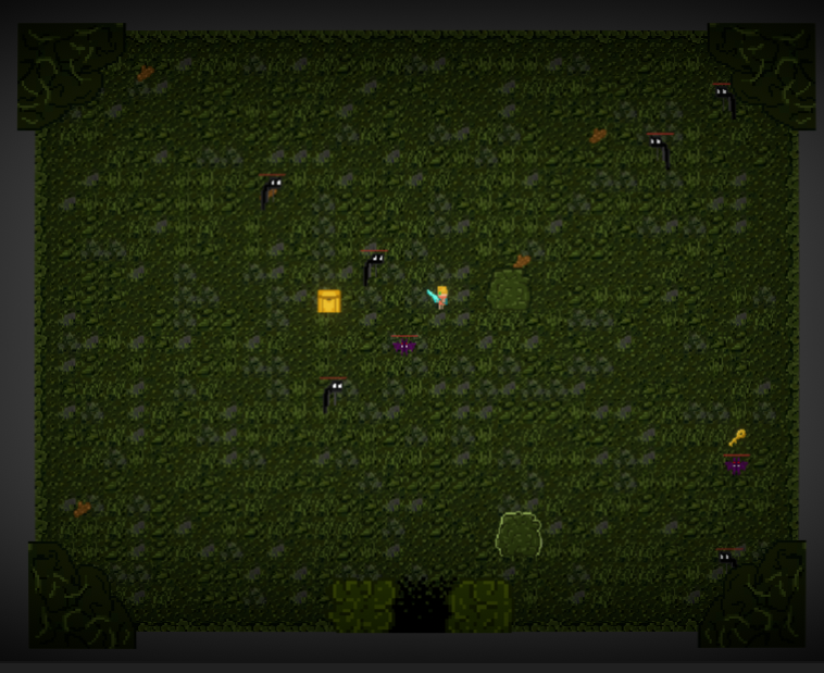
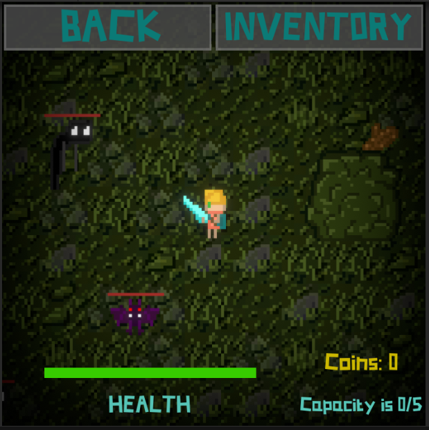
Forest:
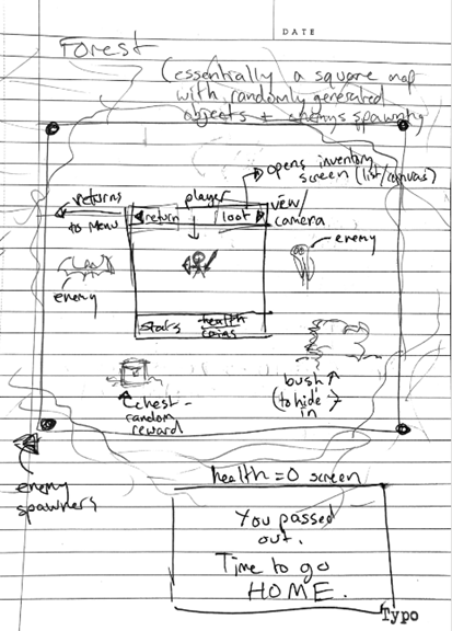
The forest is pretty much identical to my original plan. There's really not much else to say here, other than the exit at the bottom which was mentioned earlier.
Home:
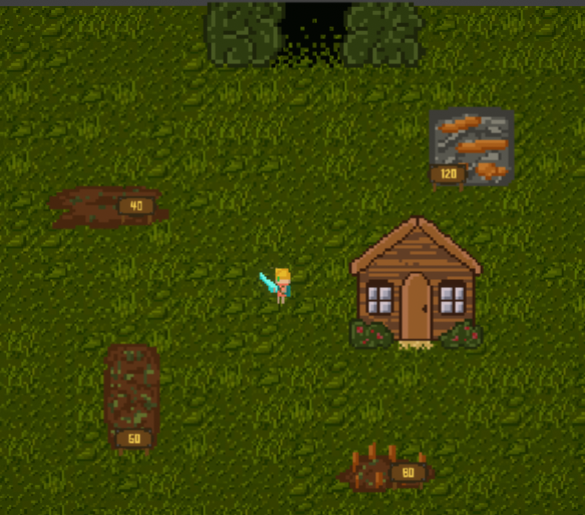
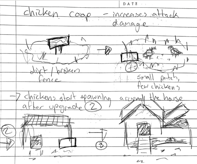
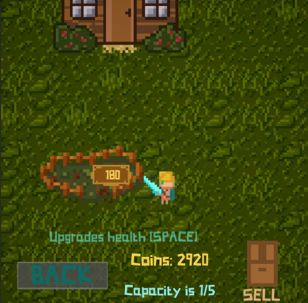
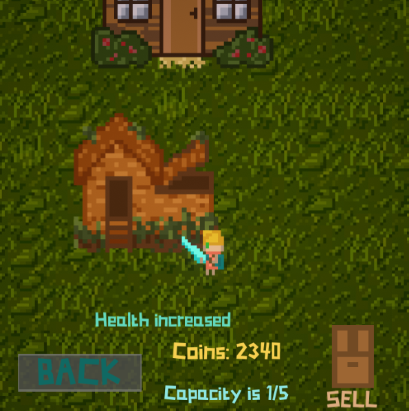
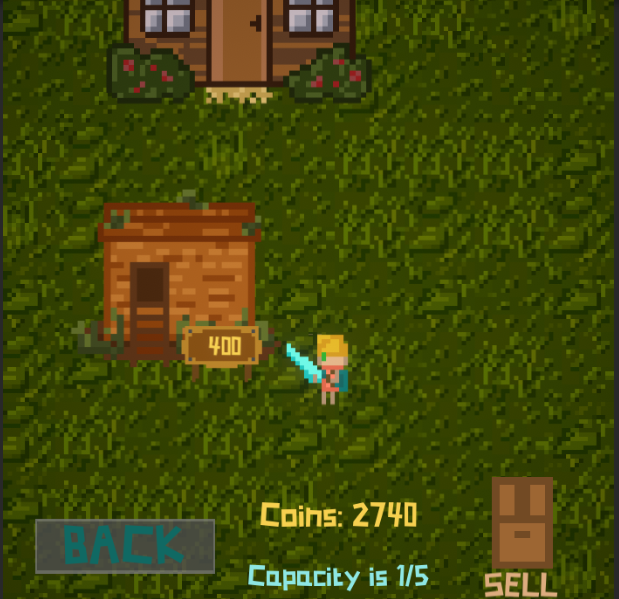
One of the only changes made to the home was not having pet chickens walk around. I didn't end up drawing a sprite for them so I couldn't add them. Maybe in future I will add them. The upgrades also only use coins, where they were going to use other resources to fix as well. I may also add this feature later. The upgrades themselves got swapped around, e.g. the chicken coop (shown below) increases health rather than attack damage now. Other than those and the 'exit' up the top it has mostly stayed the same as the original plan.

Menu screens:
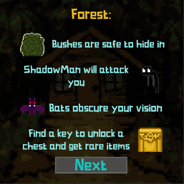
Initially, there was just the main menu, controls and 'swap'/'in-between' screens. I have since added 2 other screens to include 'help' such as game mechanics like the bushes, chests, upgrades etc. These help menus were to aid the player in understanding what they should be doing in the game, while leaving some of it up to the player, e.g someone could want tot sit in a bush and hide, or someone may want to run around dangerously and kill things, or someone might want to try find all of the chests as quickly as possible and go home. Some people may want their money from selling items, and others may prefer getting it from killing enemies. They may run around and pick up logs off the ground or try to get the more expensive gems. These options are all up to the player so I left the 'help' menu pretty open.


Feedback
The testing session we had in the unit was incredibly beneficial for me. It helped me find a few bugs and also change a few aspects of the game that were a bit wonky.
Bugs:
- When someone got hit twice in one frame and their health went to -1, the game's die check did not succeed. This was because the check was a (x == 0 ) rather than (x <= 0). This was a lucky find as I didn't even consider someone could get hit twice on one frame.
- The edge of the camera bounds were not properly lined up with the edge of the player bounds, allowing the player to walk out of frame. This was fixed by adjusting the collider.
- The volume was a bit loud on the first screen. This got lowered (from 0.3 to 0.1).
- The music would start with a delay on the home screen. This was actually due to a 1s loading time for the scene, so I fixed this by changing the music before swapping the scene rather than after. This made the music contnue playing while the scene loaded.
- The darkness effect by the bats was way too small and would completely disappear any time a bet went far away from the player again. This was really still a work-in-progress feature for me but the testing session reminded me to fix it properly.
Suggestions/improvements:
- A few suggestions were for the text that pops up on screen. One was a popup for when you try picking up an item but your backpack is full, and the other was to add "[Space]" at the end of the txt popping up after you hover over an upgrade, to remind you how ot buy it. These were both good suggestions and I added them.
- One suggestion was to create a little tunnel between the two scenes for users to walk through. This was a great suggestion that I loved and immediately implemented. I feel that the implementation is so smooth you can hardly even notice the player moving slightly where on screen it is.
- One idea was to sell items one at a time, to give the player more ways to interact (because people love to click things). This was pretty easy to implement, I just had to change selling things from all at once to one at a time.
- One question I was asked was why the scene was called Home if there was no house. I forgot that my original plan had the house in it, so I drew a sprite to stick in the scene. It doesn't have any upgrades though, since I didn't have time to draw multiple sprites.
- One thing I noticed while people were playing was that people didn't understand how the bushes work. I decided to change the way the 'help' menu was displayed so that people knew there was another menu for the actual objective and mechanics of the game.
- One note was that the 'sell' menu was off centre. I hadn't noticed this as the objects were all technically centred by unity but looking at it I had to adjust it slightly since some items were different sizes.
The feedback greatly increased the quality of the game, and helped me fix things I didn't even know were broken.
One issue I was unsure about was whether to change the controls for the sword attack. Some people had commented earlier before testing that they were confused on how it worked. In my feedback form I asked users whether to change it or not, and the general consencus was that it was fine, so instead of changing it I updated the 'controls' menu to explain how the sword worked.
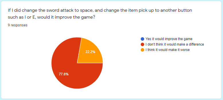
The feedback form was also very helpful to confirm that the game was not too easy/hard, and that the controls were suitable.
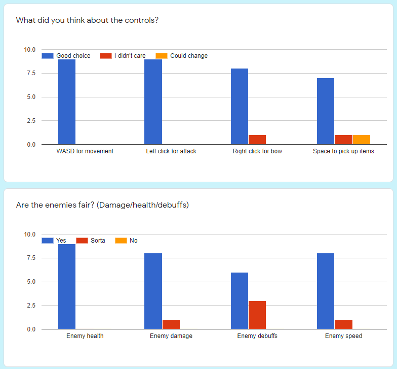
Note the slight change in enemy debuffs, this was due to the debuffs not working properly at the time of testing.
Assets
Sprites:
Every sprite was custom drawn by myself.
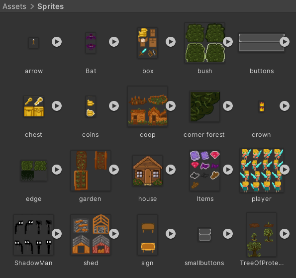
Note that some sprites are unused, such as the bush with a black outline and the larger box in 'box'. I added them so I would have more options when designing the game.
Tiles:
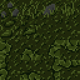
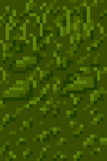
The tilemaps (also drawn by me) are just simple tiles with a diagonal grass parttern and some lighter coloured streaks and some rocks. The home tiles are just recolours of the forest ones, without the rocks or edges. The tilemaps have edge colliders to stop the player from going out of bounds.
Scripts:
This project contains over 50 custom scripts. These scripts all have different purposes, and about 50 are used in the final game.
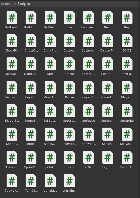
One script, Variables, is attatched to a gameobject named VariableSaver that has the DoNotDestroyOnLoad attribute, and contains every variable in the game (for example the player's maximum health, the inventory size, items in the inventory, item sell prices, enemy health, enemy drop chance, weapon damage, building levels and building upgrades. These are almost all public variables that can be accessed and changed by any object at any time.
Another script, BatMovement, controls the movement of the bat enemies, as does ShadowmanMovement for the shadowman enemies.
PlayerHealth, ShadowmanHealth and BatHealth all look after any damage taken by their respective objects.
HealthBar is a script attached to the small health bars that appear on each enemy, and changes the transform.scale as health decreases for the enemy.
ItemHover is a script that changes an item on the ground's sprite as it collides with the player's reach, giving the illusion of a 'glow' effect as you are in range to pick it up.
ChestOpen is a script that instantiates a random number of item prefabs when the corresponding key is picked up by the player.
Prefabs:
The prefabs Gem, Book, Log, Shadow and Wing are all prefabs for gameobjects that correspond to the items they are named after. They are instantiated with certain transforms as items to be picked up by the player.
The Bush prefab is a sprite of a bush with a collider that returns a 'true' value for whether the player is hidden when the player touches it. The bush is a prefab, as with the Chest and Key prefabs, because they are placed randomly upon generation of the forest.
The Shadowman and Bat prefabs are the enemies used by the spawner object in the scene. The spawner waits a certain amount of time, then 'spawns' a randomly selected enemy at one of the corners of the map.
The Bloodspurt and SwordAttackPart are particle system prefabs that are instantiated when needed to create visual effects on screen, one on enemy death and one when you swipe your sword.
The two Arrow prefabs are identical except they have different sound effects that play when instantiated/ 'fired'. They also have a script to destroy them after a period of time (about 1.5s) and to damage enemies on collision.
Animations:
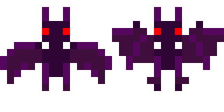
There are 3 main animation controllers, one for bats containing a single loop of two sprites, one for shadowman with a blendtree with 4-way directional movement and a single idle animation, and one for the player with a blendtree with 4-way directional movement and 4-way idle animation depending on where you were facing last.
Sounds:
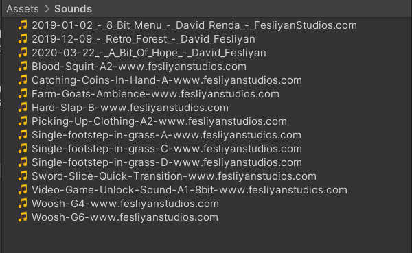
All sounds and music in the project were from https://www.fesliyanstudios.com/. Every file name has been unchanged so to find it online just search up the name.
The music tracks were actually the same tracks I chose in the concept devlog. Since they were all from the same artist I found they worked quite well together.
Menu music - "8 Bit Menu"
Forest music - "Retro Forest"
Home music - "A Bit Of Hope"
Scenes:
There are 7 scenes in HOME.
- MainMenu - a scene with a canvas of the main menu, with clickable 3 buttons that change scenes (play, controls, help) and 'music' object with an audiosource that plays music
- Controls1 - a scene with a canvas of the controls, with a button to change scene (back to main)
- Controls2 - a scene with a canvas of the help 1/2 screen with a very original name, with a button to change scene (next - help 2/2 )
- Controls3 - a scene with a canvas of the help 2/2 screen with another very original name, with a button to change scene (back to main)
- Swap - a scene with a canvas with 3 buttons to change scenes (forest, home, and back to main)
- Forest - a scene with a tilemap with a spawner object for enemies, a spawner object for the chests, bushes, keys and logs, the player object, the tunnel between scenes, a cinemachine camera and a canvas with interactable UI, including an inventory menu that can be toggled and a button to return to the swap scene
- Home - a scene with a tilemap with the player object (minus the weapon abilities), a cinemachine camera, 4 building objects with their own sign and mini worldspace canvas, a house object, the tunnel between scenes and a canvas with interactable UI, including a sell screen that can be toggled and a button to return to the swap scene
Other:
This game uses the font "Somerset Barnyard Font" by Chequered Ink, found here. I think this font suits the game style very nicely without just being pixel text.
The game uses the Cinemachine camera, with a pixel-perfect camera component since the game uses pixel graphics. It also uses post processing volumes to add bloom, vignette and even a slight lens distortion. These are all part of the unity package manager.
I used the unity recorder tool to record a few videos of the game while in development. This was also part of the unity package manager.
User Guide
Game name: HOME
Controls
The controls are basic WASD Movement, left click for a sword attack where you are facing, right click for a ranged attack where the mouse is, space to pick up items and purchase items, and left click to interact with the on-screen buttons.
Gameplay
The player starts on the main menu screen, where they can choose to play, view the controls, or view the help menu.
The controls menu explains the above (controls), and the help menu explains the mechanics listed below.
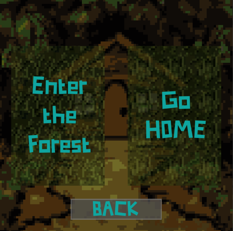
Once they hit play, the player can choose whether to enter the dark forest, or to go to their HOME.
The forest contians enemies such as bats and shadowmen, which can be killed for money and items. There are bushes the player can hide in, to stay safe from the enemies, and keys scattered around the map thta open chests for rarer items. There is a button to view your inventory (and pause the game), and a button to return to the previous screen. The player can also exit the forest via a tunnel at the bottom of the screen.
The HOME contains broken down buildings that require money to upgrade. These upgrades will in turn make the player more powerful, increasing damage, health, inventory size and luck. These upgrades increase in cost as they get more powerful, but as the player gets more powerful they will make more money, so they both scale nicely with eachother. If the player upgrades everything they get a nice prize at the end.
Game screens
The first screen, the main menu, contains 3 buttons. The menu theme plays on this screen and continues until the player enters the forest/goes home. The buttons each lead to another screen with more options.
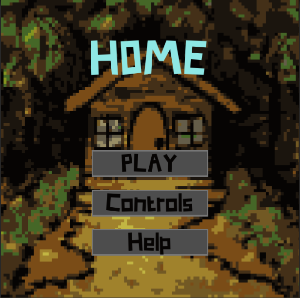
The 'Controls' button leads to the controls menu which explains the basic controls to the player.
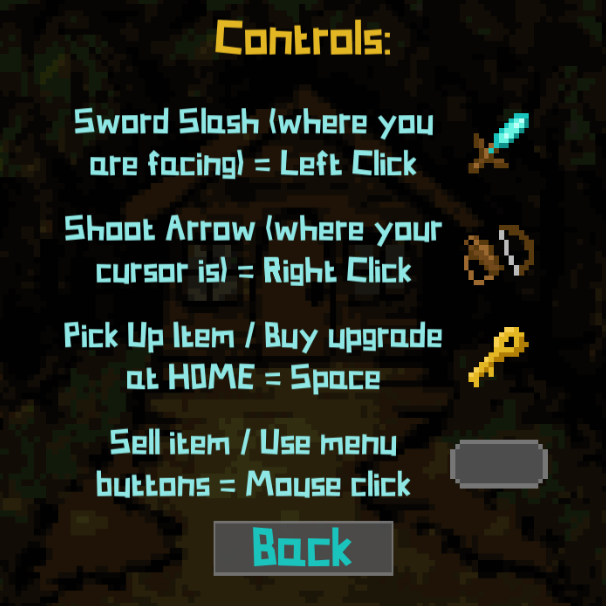
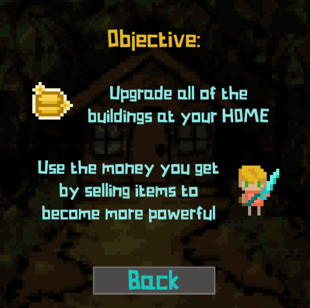
The 'Help' button leads to the following menus (in sequence). They explain the mechanics of the game and the 'win' condition.

The 'PLAY' button leads to this menu, officially titled the 'swap' menu (but does not have a name in game). The screen has two buttons which lead to the two different scenes.
The Forest scene is where all the action happens. Kill enemies with left click for short range and right click for long range. Hide in a bush to stop the shadowmen from walking, because if they touch you then your health will decrease. Bats will darken your vision, but will not harm you. To restore your vision just take them out. Shadowmen will occasionally drop shadows, and bats will occasionally drop bat wings, and all enemies drop a number of coins on death.
Keys, coins, and other items can be picked up using space. If you collect a key, then a chest will unlock and as you walk towards it it will overflow with rare items such as books and gems.
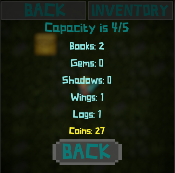
Items such as logs and books will use up inventory space, and once you reach your limit you will not be able to pick up any more until you sell them. The number of items in your bag (your 'capacity') is shown at the bottom of the screen next to your health and coins.
There is a tunnel at the bottom of the forest that the player can walk through to go home.
The 'BACK' button takes you back to the 'swap' screen (above).
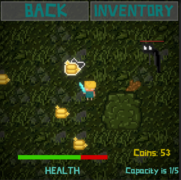
If you hit the 'INVENTORY' button at the top right, you can pause the game and view your backpack and all it's contents.
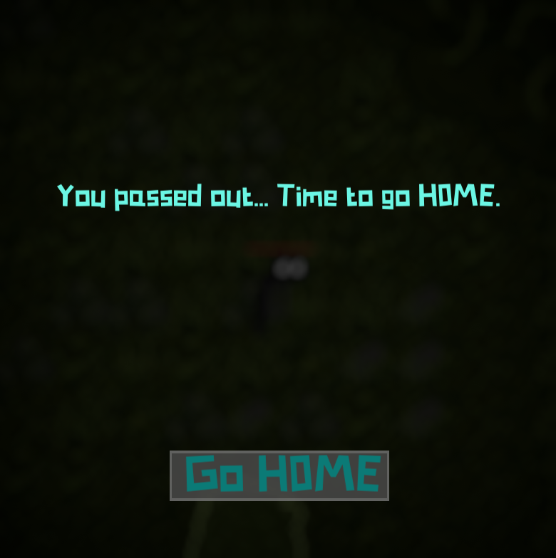
If the player reaches 0 health then they will pass out, and this screen will show. They will have no choice but to press the button and go home.
The Home scene is where the player can sell the items they have collected, and use the money to upgrade the buildings. Each building has a sign post that, when you hover over, lights up and if you have enough coins you can press space and upgrade. Each building tells you what it will upgrade when you hover over it, so you don't need to remember. The bottom right corner has a button to bring up the 'sell' menu, where you can sell any items you collect by pressing the buttons.
There is a tunnel at the top of the home that the player can walk through to go home.
The 'BACK' button takes you back to the 'swap' screen (above).
The sell screen, with your total coins at the top of the screen, has a button for each item, and shows the quantity of each item you have as well as the sell price. Clicking the sell button sells one of the item and gives you the amount of coins it is worth. The 'BACK' button closes this menu.
Sell screen
References
All audio clips / music: Fesliyanstudios.com. 2021. Royalty Free Background Music Downloads - Fesliyan Studios. [online] Available at: https://www.fesliyanstudios.com/ [Accessed 2021].
Font used: Fontspace. 2021. Somerset Barnyard Font | Chequered Ink | FontSpace. [online] Available at: https://www.fontspace.com/somerset-barnyard-font-f26620 [Accessed 2021].
Files
HOME
Will you enter the forest, or will you go HOME?
| Status | In development |
| Author | perfectcatto |
More posts
- Updates/plans after testing sessionOct 10, 2021
- HOME Feedback SurveyOct 05, 2021
- Sound/Visual effects/UI/PolishOct 03, 2021
- Upgrade mechanicsSep 26, 2021
- Player InteractionSep 19, 2021
- Player MovementSep 09, 2021
- Progress update 4/9Sep 04, 2021
- Progress update 2/9Sep 02, 2021
- HOME Concept DevlogAug 26, 2021

Leave a comment
Log in with itch.io to leave a comment.