HOME Concept Devlog
HOME
Concept statement:
HOME is a 2D RPG where you play as a young child protecting their home. Defeat monsters in the dark forest, or go HOME where you are safe. The combat provides quick, captivating gameplay with simple, easy to learn mechanics that anybody can pick up. Will you enter the forest, or go HOME?
Genre/category:
HOME is a 2D pixel art RPG. It is a role-playing game where you control a player and attack enemies, and upgrade your weapons through an upgrades system. The role the user plays is a young kid protecting their home. The game takes place all inside the child’s imagination, with all the items being common objects found around the yard and house, and the enemies being things the kid is scared of.
The genre of the game is rouge-like, and the themes of the game are fantasy and dark.
Concept creation process:
Dungeon crawlers are games where the player attacks enemies to collect loot, and uses the items to upgrade stats and attack more efficiently. HOME takes this concept and subtracts all the complications such as enemy types, weapon classes, armour classes, locations, to create a simple infinitely generating forest with enemies that scale in difficulty as the player progresses.
The art style of the game will be 2D pixel art, to fit with the child’s perception of the forest, items and enemies. The music and sound effects will be 8-bit style to fit with the pixel art aesthetic.
Example music for the menu screens
Example music for the HOME screen
Influences:
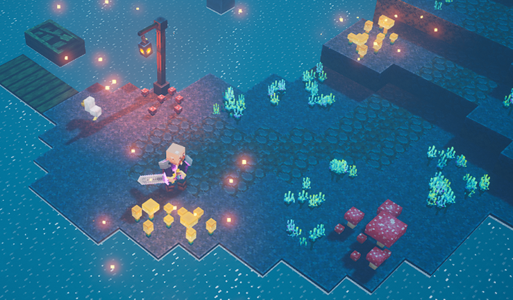
HOME takes inspiration from popular dungeon crawler games such as Minecraft dungeons and Diablo 3. These games have a large area for the player to explore, with enemies that spawn as well as treasure and other items. Usually dungeon crawlers have the player go from point A to point B, but HOME will just have one area that you can leave at any time via a button. You also get sent out of the area when your health runs out.
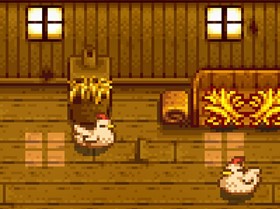
The art style and music take inspiration from games such as Undertale, Stardew Valley, Terraria and other 2D pixel art games. Stardew Valley in particular has a very cosy country feel to it, with lots of warm colours in the art, this design aspect will be important when creating the pixel art sprites. Taking this concept further, all forest sprites and enemies will have a darker, desaturated feel to create a real contrast between the ‘dark’ forest and the ‘safe’ home.
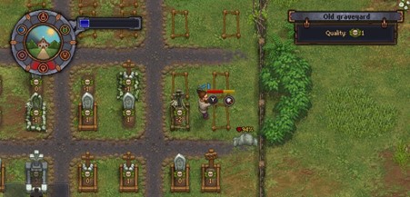
The game with the most influence on the design of HOME is Graveyard Keeper, a 2D RPG game about maintaining a deteriorating graveyard and solving mysteries in the town. The visual style of this game is very appealing to me, and something that would be very good for HOME to attempt to replicate. Note that just the visual style is going to be replicated, not the gameplay.
Audience and competitive analysis:
The target audience of HOME is people who play games casually. The game is meant to be small, able to be completed in a short period of time (an hour or so) and have accessible controls for any users. People who play games casually usually aren’t the best at complicated control or weapon classes, so the weapons in HOME are simple with simple buttons for use.
The game isn’t targeted towards any certain gender or age group, rather being something for anybody that enjoys games to play and experience.
Other target audience members are people that enjoy the pixel art style, which this game will (hopefully) appeal to, with a charming style that is appealing to the eye.
The competitors for the game are other big name pixel art RPG games such as Stardew Valley and Graveyard Keeper. Although they have similar styles, these games are much larger and have many many hours of gaming content inside them, so HOME stands out as a much smaller experience.
Game treatment / concept art
The game consists of a randomly generating combat area, where the player attacks enemies and collects resources, and a peaceful area, where the player can use their resources to upgrade their skills and surroundings. The core mechanic of HOME is the idea that once you collect an item, you keep it regardless of whether you pass out. This means that every little bit of damage and collecting you manage to do contributes to your overall total. Your resources collected can be sold for money, which can be used to buy upgrades for your weapons, inventory size and health.

The title screen has two buttons, one which leads to the controls guide, and the other which leads to the play menu. It also has an exit button to exit the program. The controls guide explains the movement, sword attack, ranged attack buttons and item collect buttons. The play screen opens either the forest or the HOME scene. There is also a button on this screem to return to the main menu.
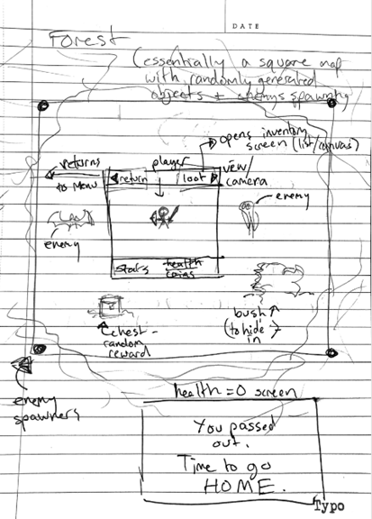
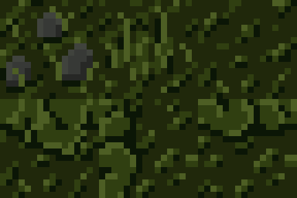
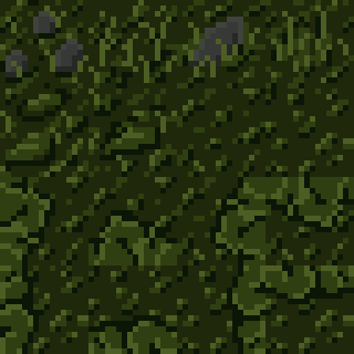
The forest is going to be a randomly generated tilemap with different tiles such as treasure chests, bushes that the player can hide from enemies in, random items on the ground such as logs or sticks, and a border of thick forest.
The enemies are spawned randomly from spawners that are hidden behind overhanging tree images. The view of the player is much smaller (as illustrated by the box) than the actual forest map.
The player’s view also contains a UI displaying the player’s health and money.
There is a button on the top left to return to the previous screen (which will also refill the player’s health and reset the forest) and a button on the top right to show the player’s inventory, which will glow red when full.
When the player reaches 0 health, the screen at the bottom will overlay and the player will be returned HOME.
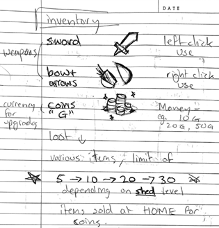
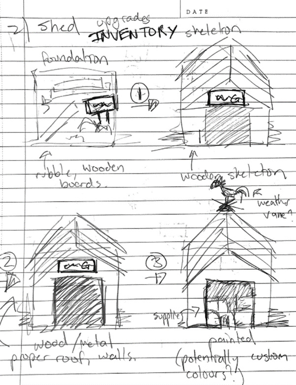
Inventory items, the sword and bow will take up the first slots, and then any loot collected will take up the rest. The maximum inventory size scales with the level of your shed.
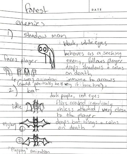
Concept for a few enemies. More may be added in the future.
WIP: enemy movement sprites:


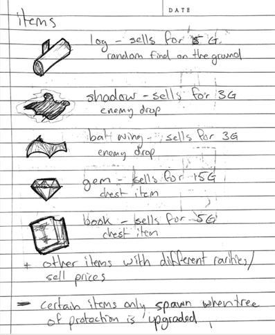
Items list, more will be added in future as game progresses. Each item is found either as a random spawn on the ground, dropped from an enemy, or found in a treasure chest]
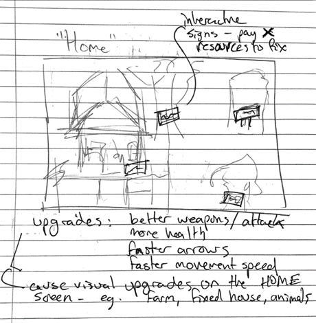
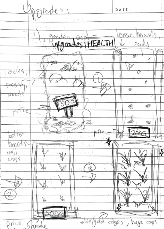
A basic tilemap with a few features that have signs on them with coin amounts. Standing in front of a building and pressing a key will buy the upgrade, and the sprite will update to have a nicer version.
There will be a button for opening the trading post menu, and a UI with the player’s coin amount.
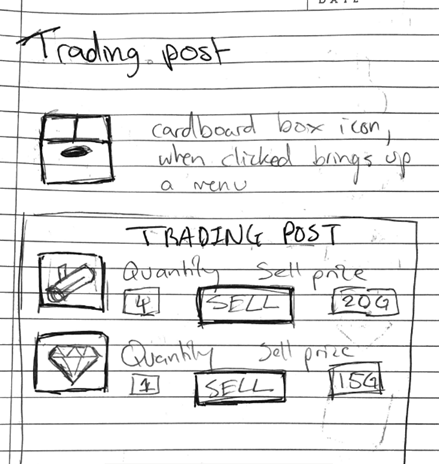
The trading post will be a cardboard box icon at the bottom left of the HOME screen. Clicking it brings up the trading post menu, which displays a list of the player’s current items, the amount, the sell price, and a button to sell it.
Below is concept art for sprites for progression of different structures. The upgrades for each building correspond to different skills:
- Garden bed – maximum health
- Shed – inventory size
- Chicken coop – attack damage
- Tree of protection – enemy spawns and drops
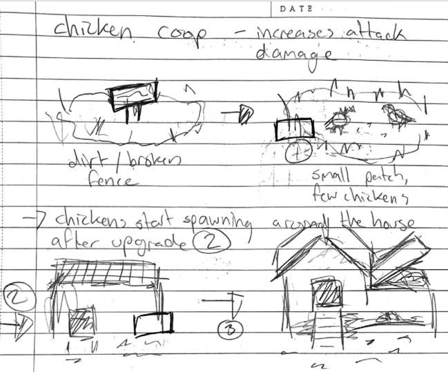
After the chicken coop is upgraded, then friendly chickens will spawn on the farm. This aims to make the game feel more lively.
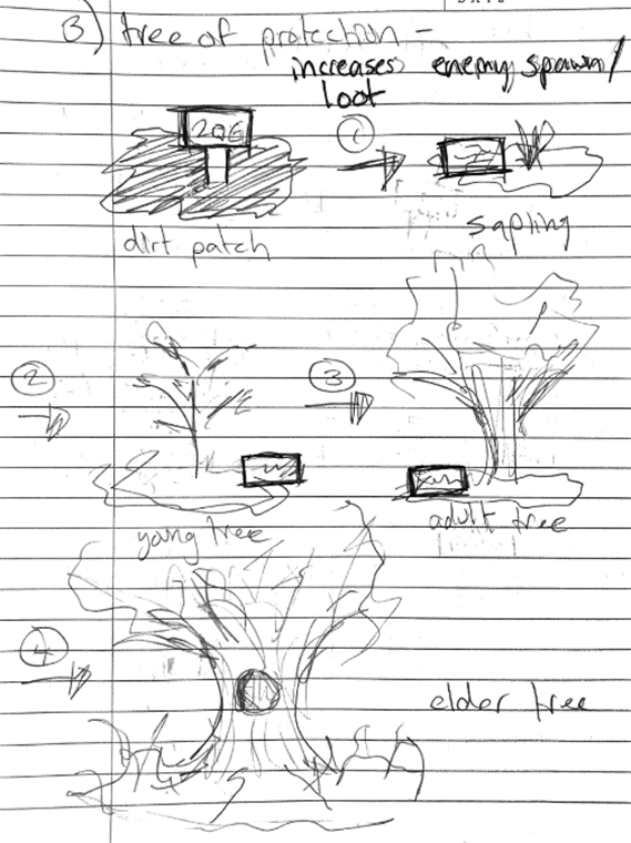
Image sources:
Minecraft dungeons: https://minecraft.fandom.com/wiki/Minecraft_Dungeons:%3F%3F%3F
Stardew Valley: https://www.gameskinny.com/uzysz/how-to-feed-chickens-in-stardew-valley
Graveyard Keeper: https://dropthespotlight.com/the-balanced-blade-graveyard-keeper-review/
HOME
Will you enter the forest, or will you go HOME?
| Status | In development |
| Author | perfectcatto |
More posts
- Documentation + User GuideOct 17, 2021
- Updates/plans after testing sessionOct 10, 2021
- HOME Feedback SurveyOct 05, 2021
- Sound/Visual effects/UI/PolishOct 03, 2021
- Upgrade mechanicsSep 26, 2021
- Player InteractionSep 19, 2021
- Player MovementSep 09, 2021
- Progress update 4/9Sep 04, 2021
- Progress update 2/9Sep 02, 2021
Leave a comment
Log in with itch.io to leave a comment.